Overview
My team of 5 software engineering students were tasked with enhancing a basic command line interface (CLI) desktop address book application for our Software Engineering project.
As computing students, we face a lot of projects and assignments every day. The intense workload and fast-paced environment can make us forget the things that we need to do. We feel stressed out easily as we do not know how to manage all our tasks in an organised manner.
Therefore, my team came up with ELISA. ELISA stands for Exceptionally Loud and Intelligent Student Assistant. ELISA helps students by keeping track of all the tasks that he/she may have, as well as provide companionship to alleviate the stress.
Application introduction
This is how our application looks like:
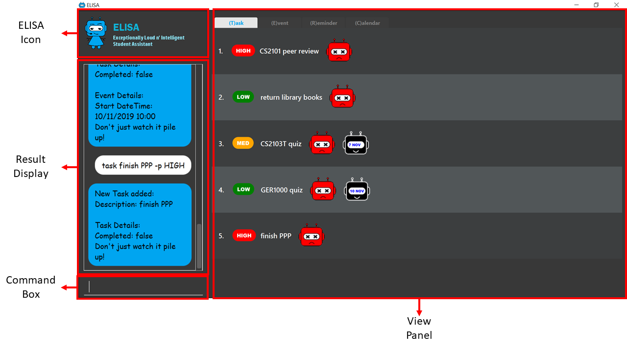
The rest of the report will refer to this components and so their function will be briefly explained.
| Component | Function |
|---|---|
ELISA icon |
Icon of the application which changes with the different mode of the application. |
Result display |
The "chat box" with ELISA which contains all past user input and ELISA’s response. |
Command box |
The user can type their commands here to interact with ELISA. |
View panel |
The current view of the application. It can show the task, event, reminder or calendar panel. |
Summary of contributions
In this section, I will be briefly going through my contributions to this team project. For the full extent of my contributions to the project, please visit here.
Major enhancements:
- Added Game Command
- Refactored and designed ELISA’s UI
Minor enhancements:
- Added Navigation Features (show, up/down)
- Added Visual Features (theme)
Functional contributions
-
Game mode (Major Feature):
What does it do?
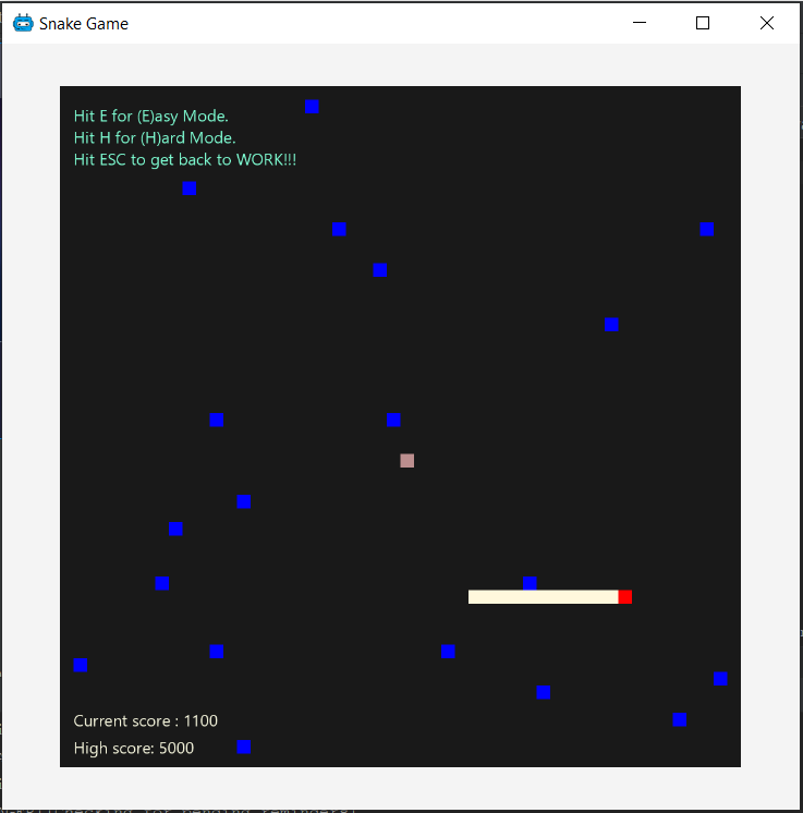
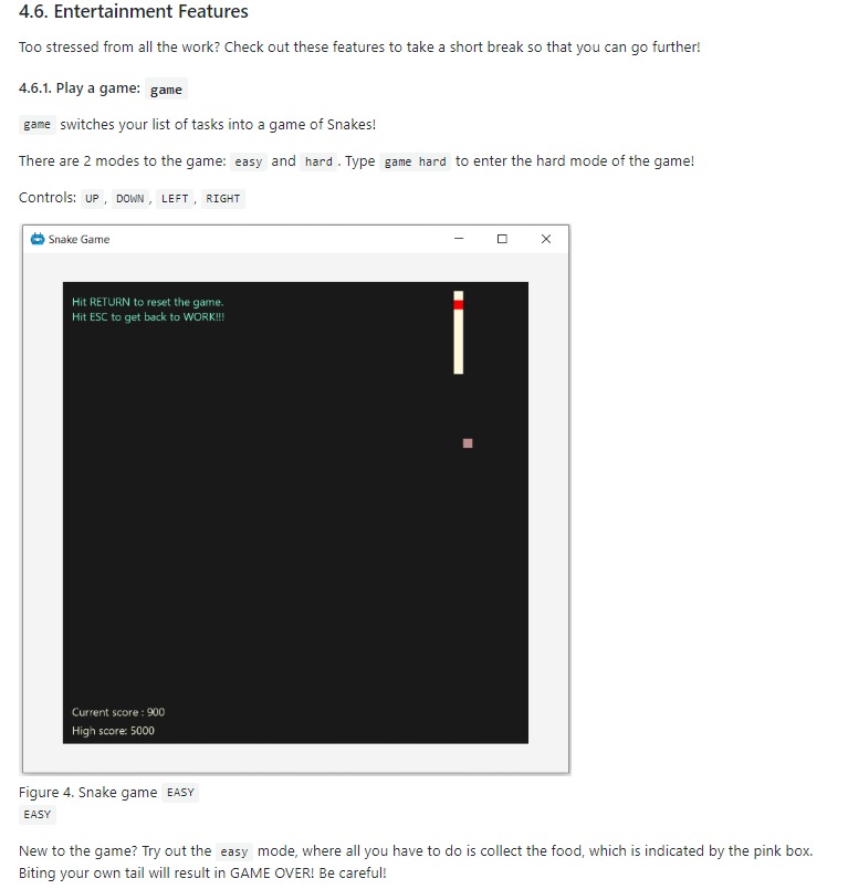
This feature allows users to enter the Game mode to take a break from all the work. After entering the game mode, users will be able to play the traditional Nokia (phone) game: Snake. Snake has a very simple rule: Eat the food and do not bite your own tail! The game does not take up a lot of time and therefore is the best game for a short break.
Why make it?
Users may get stressed or burnt out when they are constantly doing work non-stop. The game mode is developed as an avenue to take a break from all the work and provide a form of entertainment. Taking a temporary break to recharge will definitely help the user be more productive later on.
Why is it special?
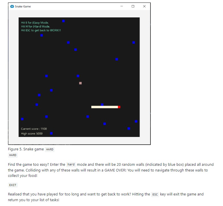
There are 2 difficulty levels in this game feature: Easy and Hard. In the easy mode, there are no walls (indicated by the blue box) whereas in the hard mode, 20 walls will be randomly spawned in the game space. Colliding into these walls will result in GAME OVER. The option for a hard mode is provided to keep the game interesting as the walls are in different positions every round. Users that have gotten used to the easy mode will be able to stay engaged in the hard mode.
This feature is very special because there is no task tracking app in the current market with a built-in game feature with the sole purpose of providing entertainment. Many people are neglecting the importance of taking breaks and the effects it has on boosting productivity. I hope that this feature will be able to encourage these people to take breaks.
Difficulties?
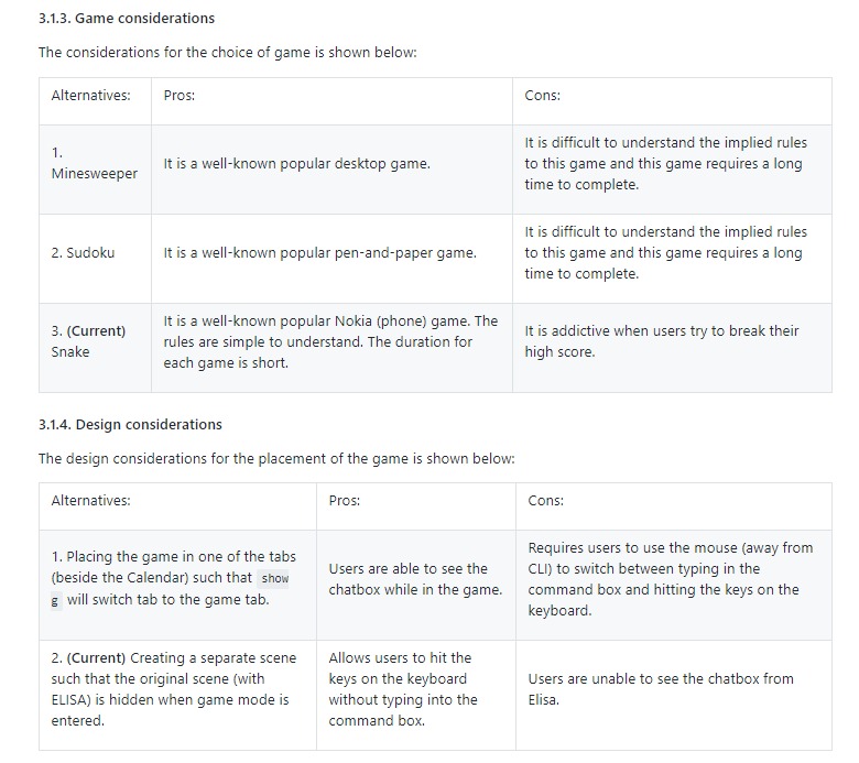
The difficulty of this feature is mainly the need to integrate this feature into ELISA. Originally, I wanted to run the game in a separate tab (Refer to the annotated figure above) from the list and calendar tabs but to do so would mean that the user has to click into the tab when they want to play the game and click the commandbox when they want to type a command. This is very problematic as ELISA is designed for CLI users which meant that they do not want to use the mouse.
I worked around that problem by implementing the game feature using a separate scene from the ELISA’s scene. This means that when the user enter the game mode, he will not be able to see ELISA and his list of tasks. This solves the problem I mentioned earlier as well as met the goal of encouraging the user to take a break from work.
-
Navigation Features (Minor Feature):
The following features are features that allow the application to be completely CLI based. Since ELISA is designed for CLI users, I have to provide a way for the users to navigate through ELISA without the use of the mouse.
show T/E/R/C switches the tabs between the lists and calendar views.
up/down scrolls the list up/down.
-
Theme Feature (Minor Feature):
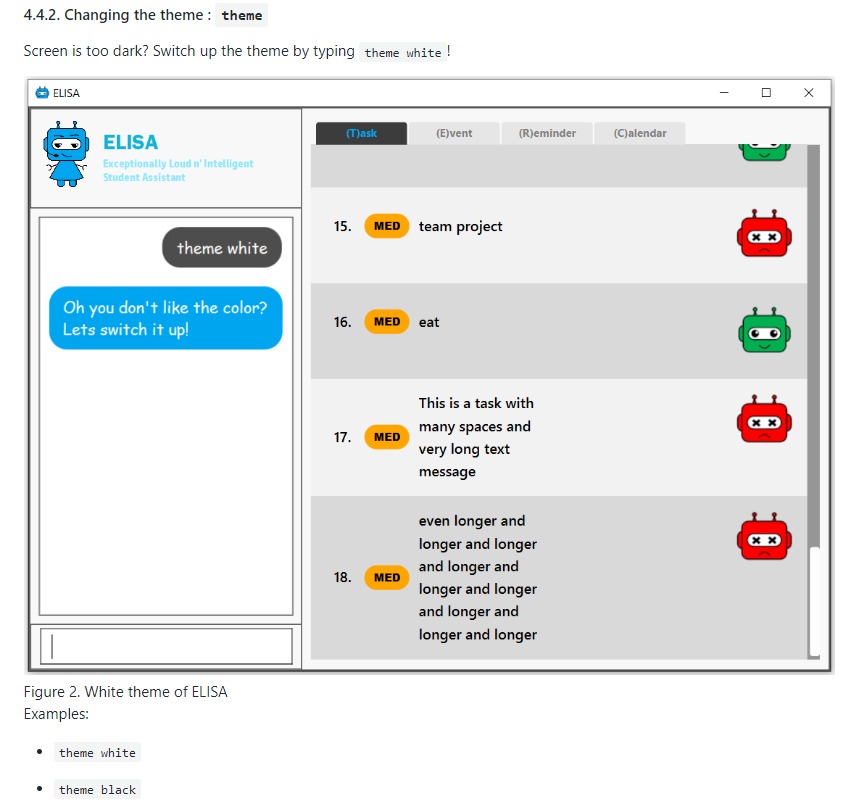
The theme feature is to allow users to change the colour scheme of ELISA. This feature is very useful especially when the screen it too bright/dark depending on the location that the user is in and switching the colour scheme will make ELISA more visible.
-
UI integration (Major Contribution):
For this section, please refer to the annotated diagram above.
I designed the entire UI of ELISA to display the features that ELISA has. While UI may not be considered a feature, it is a huge part of whether an app is user-friendly and therefore I have devoted a significant amount of time into its design.
Firstly the mascot, ELISA. ELISA is a female student assistant, therefore the overall structure of ELISA is that of a female robot. The colour blue is chosen because blue is the most popular colour in the world. (according to a study by Philip Cohen from the University of Maryland) It is a colour often found in nature and people always describe blue as calm and serene, which is what we want users to feel.
Secondly, the chat style Result Display. I designed it to be a chat style display so that it would seem like ELISA is an intelligent companion. The chat bubbles allow users to experience texting with a friend (like other instant messaging apps) which has been proven to be helpful in alleviating stress.
Thirdly, the intuitive icons of ELISA that displays information in each list. Green ELISA with a cheerful appearance indicates that a task has been completed while Red ELISA with a crossed eye indicates that a task is incomplete. These icons make ELISA more interesting and friendly to the user as it further personifies ELISA by giving her emotions. Additionally, there were actually more ELISA icons that were designed but not used in the final product because of time constraints and the difficulty of aligning all the elements of the app.
Other contributions:
-
Project management:
-
Refactoring:
Refactored the UI classes as well as the DarkTheme.css file so that it is able to integrate with the project.
-
Documentation:
Contributions to the User Guide
Given below are sections I contributed to the User Guide for my main feature. They showcase my ability to write documentation targeting end-users. |
Firstly, I designed the heading banners to make the UG more friendly as compared to plain text headings.
Secondly, I rearranged the features of the UG into better headings such as Visual Features, Navigation Features, CLI Features etc. This improves readability of the UG.
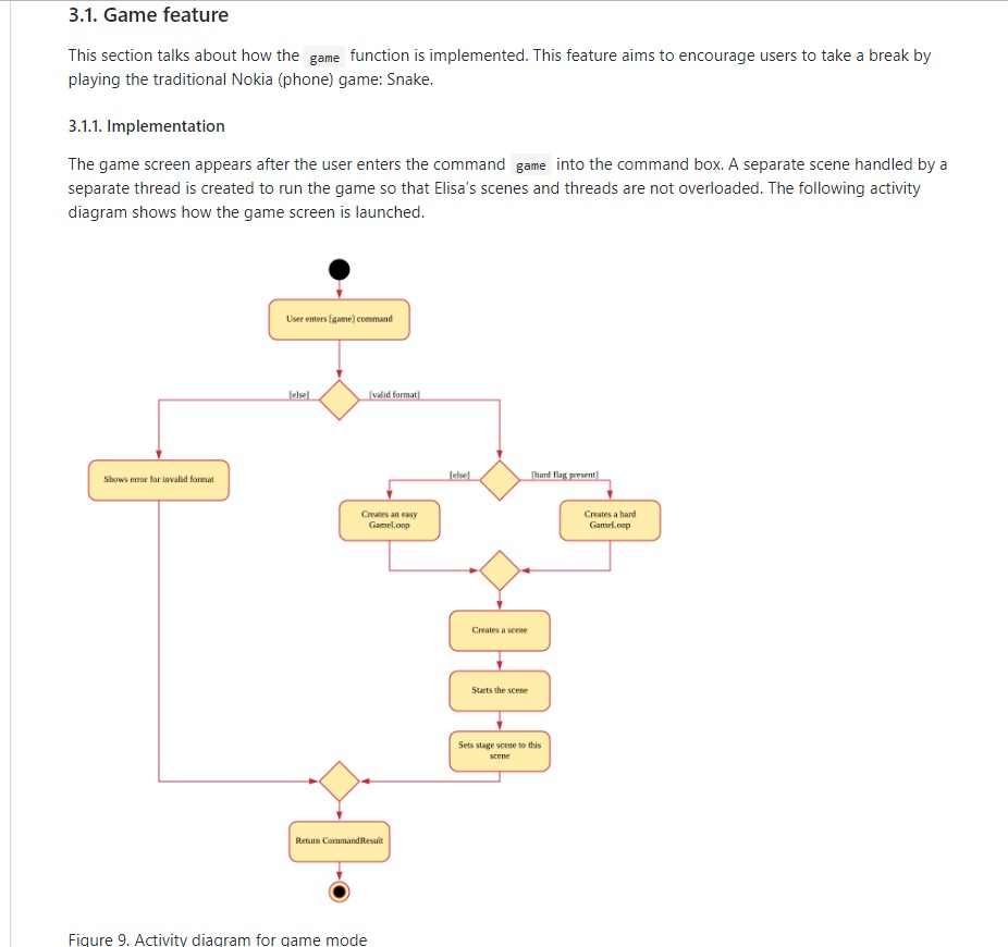
Thirdly, I wrote the Theme Feature, Calendar Feature, Navigation Feature and Game Feature portion of the UG. I will show the Game Feature portion of the UG here below.
Contributions to the Developer Guide
Given below are sections I contributed to the Developer Guide for my main feature. They showcase my ability to write technical documentation and the technical depth of my contributions to the project. |
I updated the UI component of the DG as it had been refactored and new classes are added such as TaskListPanel, TaskListCard, ElisaDialogBox etc.
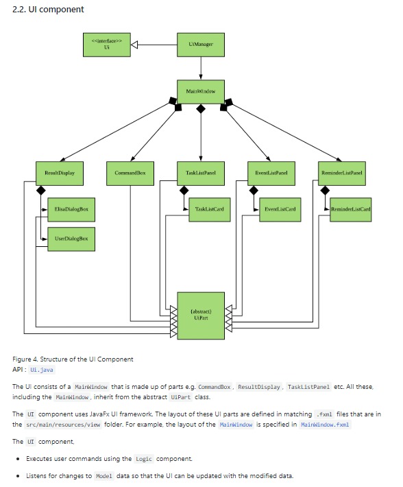
+
I also updated the Game Features portion of the DG as it is a major feature that I have implemented.
